General Information
All non self-explanatory blueprint classes and most functions or blueprint graphs in general, have a blue comment within them that explain what the class is for and possibly how it works. Also all events are inside comments to make the overview a bit easier as well as a convenience in finding a specific event when looking at a blueprint graph due to the comment title being larger than the event title. Right in front of the spawn location on the lobby and game maps there are comments on the wall that explain typical use cases lobbies and game maps.
You’ve probably noticed that almost all files are inside the OGMainMenu folder instead of directly in the Content folder. That’s on purpose. It makes migrating this template into your own project (or the other way around) much cleaner. In most cases, folders like “Characters” or “GameModes” already exist, and mixing them with template content can get messy fast. If you do want everything in one place, feel free to move the files after migrating. If not, no need to thank. Just smile, nod, and enjoy the folder structure.
Common UI
Overview
Citing the Unreal Engine Common UI Documentation:
“Common UI supports the development of cross-platform UIs with complex navigation, such as menus with layers, submenus, or popups. Originally developed for UI in Fortnite, this plugin is available to Unreal Engine users through the Plugins menu.”
Problems Common UI Solves
- Selective interactivity between layers of UIs
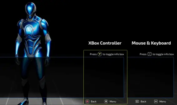
- Handling of various input methods through all the different platforms and controllers (ie. Mouse and Keyboard, Playstation Controller, Xbox controller, Smartphone etc. )
- Return to the previously selected element with cardinal navigation in case of closing a pop up for example
- Display Console-specific UI Elements depending on which input method is being used.
Example Jumping: “A” Button icon when using an Xbox controller and spacebar icon when using Mouse and keyboard
Common UIs Features
- Selective widget interactivity, providing an easy way of creating rich UIs with layering.
- Multiplatform console and PC support.
- On consoles:
- Cardinal navigation management, including breadcrumbs and history.
- Console-specific UI element management.
The concept of Input Routing and Nodes in Common UI
Input Routing refers to how user input (from a mouse or gamepad) is directed to specific UI elements. It ensures that only the relevant widgets can respond to input at any given time, helping manage complex menus. For example, one button may always receive input, while another only gets it when selected.
Nodes are the building blocks that handle input routing. CommonUI turns widgets into nodes, which are organized in a tree structure. Each node represents a part of the UI, such as a button or a menu, and the tree shows how they’re connected visually.
When a user interacts with the interface, CommonUI checks which node (=widget) is on top and sends input to that node. The node then forwards the input to the next relevant part of the UI until it’s processed. This method keeps input management clean and efficient, especially for complex layouts.
Activatable Widgets
Within Common UI, only certain widgets are converted into nodes for the purpose of handling input, and only widgets that are ready to handle input receive input. These widgets are called activatable widgets, and they are considered “active” if they are ready to receive input.
Activatable widgets help manage input flow, especially in overlays. If an overlay widget is dismissed, CommonUI ensures that input is routed to the next active widget, even if it’s on a lower UI layer. Only the topmost active tree receives input at any time, so lower layers don’t need to worry about being inactive if they’re still in use.
Throughout the template, you will notice widgets inheriting from the Common Activatable Widget class. Widgets inheriting from this class usually aren’t created like normal User widgets usually would. Instead they get pushed on Stack layers and become active by doing so.
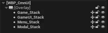
Layers in Common UI
In this template, different types of UI content are managed by specific layers. Each layer represents a stack of widgets that can be pushed or popped/deactivated to control which UI elements are visible at a given time.
The layer structure used in this template consists of:
- Game: For HUD and similar elements.
- GameUI: For gameplay-related menus (e.g., inventory).
- Menu: For settings or options screens.
- Modal: For overlays like Pop-Up windows.
- PopUpMsg: For Pop-up Messages
When a widget is pushed onto a layer with existing content, it replaces the current widget until it is deactivated (popped off). For example, pushing a new UI element onto the GameUI layer replaces the old one.
Each layer operates as a separate stack, so when a new widget is pushed onto a higher layer (e.g., Menu), the layers below it remain visible. This allows for flexible, non-overlapping UI structures.
Initial Common UI Setup
These are the steps this template took to properly setup common ui. You don’t need to do them if you build on top of the OG Main Menu project. However, for your convenience and because templates should also be learning material, the steps that were taken are listed below:
- Enable the Common UI Plugin and restart the engine.
- Open Edit > Project Settings > Engine > General Settings and set your Game Viewport Client Class to CommonGameViewportClient.
- Create an Input Action for each of the following Common UI Actions:
- Accept, Back, NextTab, PreviousTab.
- Create a new Input Mapping Context and add the Input Actions created in the previous step to it. Also, assign a keyboard and controller key to each.
- Create a new data asset of type Common Mapping Context Metadata.
- Assign Common Input Metadata to the field called Enhanced Input Metadata
- Check Is Generic Input Action.
- Create an element for each of the Input Actions that you’ve created in step 2, set it’s value to Common Input Metadata, set Nav Bar Priority to 10 and check Is Generic Input Action.
- Go back to each Input Action that you have created, open it and expand Player Mappable Key Settings.
- Assign the Data Asset you have created to it.
- Set it’s Name and Display Name values (For the Back Key for example: “Back” for both).
- Create a blueprint class of type Common Input Base Controller Data.
- Set it’s Input Type to Mouse and Keyboard.
- Create an array element inside the Input Brush Data Map for each key that you want to have an icon for. In these elements, assign the keys to their icons.
- Create another blueprint class of type Common Input Base Controller Data.
- Set it’s Input Type to
- Set it’s Gamped Name to Generic and it’s Gamepad Display Name to the platform ie. Xbox/Playstation Controller probably.
- Again, create the wanted array elements inside the Input Brush Data Map.
- Create a new blueprint class of type CommonUIInputData and assign the Accept and Back Input Actions to the appropriate fields.
- Open Game > Common Input Settings > Input.
- Assign the previously created CommonUIInputData class to Input Data.
- Enable Enhanced Input Support and Allow Out Of Focus Device Input. Uncheck Enable Default Input Config as it prevents the default Set Input Mode nodes from working.
- Expand Platform Input > Windows > Default and set it’s Default Input Type to Mouse and Keyboard as well as it’s Default Gamepad Name to Generic. Then expand Controller Data and create 2 elements, one for each of the Common Input Base Controller Data classes that you’ve created.
If you have additional questions, consider joining the Outface Games Discord server.
Also, checkout this in-depth tutorial on how to set up the different parts of Common UI by MrButier (and subscribe to him as well).
Common Styles
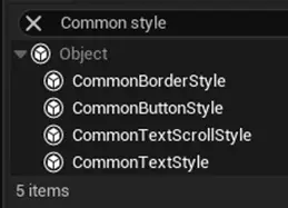
CommonUI comes with its own set of widgets, found under the Common UI Plugin section in the UMG Palette. Unlike regular UMG widgets, these don’t have built-in styling options. Instead, they use Common Style Assets to control appearance.
You’ll find the style assets of the OG Main Menu in the CoreUI folder, under the subfolders Button, Borders, and Text. Changing a style asset updates every CommonUI widget that uses it. For example, if you update the font of a CommonTextStyle asset, all CommonText widgets using that style will update automatically, making it easy to keep your UI consistent.
You can create new style assets by creating a Blueprint of the Style type that you want as you can see in the following image.
For More information, checkout the Common UI Quickstart Documentation.
Architecture
Dependencies
The architecture planned for this template regarding almost all widgets is that the Player Controller depends on the HUD, the HUD depends on the main menu widget and other independent widgets like the pause menu, the main menu depends on it’s subwidgets and single widgets depend on nothing other than their contents like fonts and images. Additionally, wherever applicable soft references and async loading was used. This way, the game is light on the hardware of the player.
Inheritance
Gamemode, Game State, Player Controller and HUD
There is one parent class each for the Gamemodes, Game States, Player Controllers and the HUDs that combines all the functionality that multiple of its children might need. The main menu, lobby and game maps all have separate classes that inherit from these. Additionally, only the parents have interfaces added to them, even if some of the functions are only used by one of their children. The reason that there isn’t a separate interface for each of the children as well, is simplicity. The scope of this project didn’t need it, you might need it, so feel free to do these changes.
Like previously mentioned, the OG Main Menu makes large use of inheritance. Not only the Gamemodes and co. use it, but also the Character class with its children that essentially are the selectable skins in the Character selection menu as well as a lot of the other classes. Take the widgets for example
Maps
There are the MainMenu, LobbyMap, the 3 game maps ie. Prison, Dungeon and Temple as well as the TransitionMap that is needed for seamless travel. The way the party system works is that it reopens the map after opening a party for the online subsystem to fully register it.
Main Widgets
WBP_CmnUI
This widget is the core widget which holds the stack layers onto which almost all other widgets get pushed on. To understand better what stack layers are, checkout the section on Layers in Common UI!
Additionally, this class handles pushing and removing widgets. This is handled by utilizing gameplay tags, one for each stack layer, then giving it over as an input through that function call, test which tag was given over and push the widget on the appropriate stack layer.
AWBP_BaseWindow
This widget is part of almost all pop-ups and generally most non-base widgets in this template (Base widget in the sense of Main Menu etc.). This widget handles removing widgets when clicking outside of the window and adds a background border. Also it has a Common Action Bar at the bottom of the screen that displays action icons that are active/clickable.
The reason the classes are not parented to it and have their widgets in a named slot is that they don’t have all the features of Activatable widgets then as they don’t fully get inherited. If intended or not, keyboard navigation didn’t work when the widgets were in a named slot.
AWBP_MainMenuBase
This widget holds all other tab menus (like CharacterMenu, HomeMenu etc.) as well as additional sub-widgets (like the party window) in it. Whenever one of these menus or subwidgets need to communicate to the HUD, either this AWB_MainMenuBase plays the middleman or via an interface.
AWBP_Lobby and AWBP_Game
These widgets do the same middle man job as the AWB_MainMenuBase but in the Lobby / Game maps. Specifically, they hold all utilized sub-widgets and can be imagined as the main HUD widget in their levels.
WBP_MouseCursor
This widget is being used as the default cursor in this project. That being said, you can change it by changing the cursor aesthetically in this widget, creating a new similar widget or by removing it from Engine > User Interface > Software Cursors and thus returning to the default platform cursor style.
AWBP_SettingsMenu
Within this widget the player sets all settings.
These are seperated into 3 categories:
- Video settings – consists of graphics and some general settings like displaying the FPS.
- Controls – allows the player to remap keys and change camera settings.
- Audio – displays multiple sliders of which everyone changes a specific audio category like UI, ambient etc. .
Inside the functions tab you can see that each graphics setting has 5 functions to it.
First, there is the getter that handles displaying the quality in the widget. Then there are two for changing that specific setting, one for setting it to a lower and one to a higher value. Finally, there are 2 more that are being used within the lower and higher functions and are necessary to check if that setting goes any lower or any higher than what it already is. If not, then that specific arrow gets disabled.
Also, there is an “overall” quality setting that handles changing all settings at once. Whenever a setting is changed to a value that doesn’t align with all the others anymore, then the overall quality shows “Custom” as a value.
WBP_SettingsItemBase
This widget is the parent of all other setting item widgets like WB_Settings_Bool or WB_KeyRemap that are extensively used inside the settings menu. This is mainly due to easily maintaining a consistent design.
Main Classes
Game Mode
The game mode keeps track of all players in a session inside an array and sends greeting as well as farewell messages into the chat whenever a player joins or leaves. Again, it’s built in a way to extend it to send any server messages at the time of choice.
Player Controller
The player controller might be the most important class in the template. It handles many things but also the chat system and settings menu. It acts as the “brain” behind these widgets. These are the only widgets that are handled by the player controller instead of the HUD.
HUD
The HUDs behave as the connection between player controller and widgets for most widgets. They hold reference to the Main widgets of each level like to the “WBP_MainMenu_Activatable” or the “WBP_Game_Activatable”. This way, they can call events/functions of these as well as of their sub-widgets.
Game Instance
The game instance has multiple “jobs” in the context of the OG Main Menu.
Firstly, to store values like the selected skin ID or the selected mode to retrieve them when traveling to the Lobby or Game map.
Secondly, to retrieve or create the appearance SaveGame file on initialization and apply it’s values to the appropriate classes through Blueprint function library functions.
Lastly, printing a log of the reason when a player disconnects due to network errors.
Player State
The player state handles replicating the profile cards to other players, as well as updating them whenever changed by a player.
Character Class
The character class handles basic movement functionality and is subclassed into multiple skin classes that each only have a different character mesh.
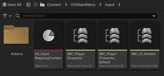
Input
This template utilizes 3 Input Mapping contexts in total.
- IMC_UI_Generic is for the Common UI Inputs like the Back Button, Accept Button, Right tab, Left Tab, as well as some menu buttons. To make it easier to differentiate, Input Actions used in this context are prefixed with IA_UI_Generic and can be found inside Input > Actions > Generic.
- IMC_PlayerCharacter is for the actual “game” controls like the pawn movement keys as well as menu buttons that are only present while controlling a pawn, here for example the Game Menu. This Mapping context is changed when changing keybindings in the settings menu.
- IMC_PlayerCharacter_Default is the same as IMC_PlayerCharacter but unedited and thus at it’s default keybindings.
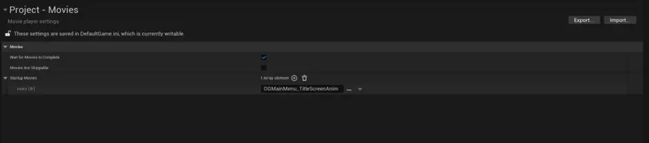
Movies
You might have wondered what that empty looking “Movies” folder in the content browser is for. Essentially, it holds video files in it that can be played as the startup movies when set inside Project settings > Project > Movies.
If you take a look in the file explorer you will notice that it has a video file in it. You could even paste in multiple startup video files and add their names to the previously mentioned section inside of the project settings to have them all be shown at launch. To be clear, with this folder you have to put the video files into the file explorer folder manually.
Tutorials
Change the Startup Video
Paste in your startup video/s inside Content > Movies using the folder explorer and add its file name to Project settings > Project > Movies under Startup Movies without the file type.
Change the Character Class
- Implement the iPawn interface into your character class.
- Copy the code from BeginPlay and Event Setup Overhead Card from BP_ThirdPersonCharacter and paste them into your character class.
- Add the OnLookLeftRight and OnLookUpDown functions to your character class and connect them to your looking event similarly to the template character class.
- If you want skins, create a child of your character class and add it to UI > Customization > DT_Skins.
- Create an anim montage and apply it to the same element inside the mentioned data table to have your character play an animation when viewed inside the character selection menu.
Add a skin
Create a child of your parent character class and add a new element for it inside UI > Customization > DT_Skins.
Add a profile icon
Create a new element inside UI > Customization > Profile > DT_ProfileIcons with the appropriate values of the new icon.
Change the template colors/fonts/style
Go to UI > CoreUI > Borders/Button/Text and change the settings inside the different blueprints that you can find there.
Change the Background Music
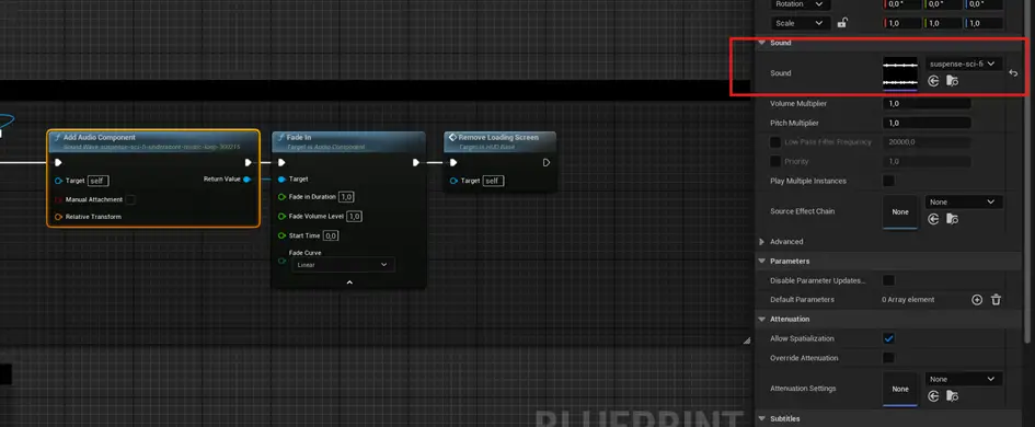
Go to Blueprints > HUD > HUD_MainMenu and change the Sound file of the Add Audio Component node inside Event Open Main Menu.
Play with a Playstation 5 Controller
Windows doesn’t recognize Playstation Controller input as is and thus the way to go usually is to read the buttons as Xbox Controller buttons (this means Xbox Controllers work by default). To achieve this, follow these steps:
- Download and install DualSenseX by Paliverse
- I use it myself and can confirm that it works but I am not liable for any damage or problems that could occur by the download, install or use of this third party software. It’s only an information about the existence of such a tool)
- Open it up and connect you PS5 controller to your computer with a USB cable. (The same one you recharge the controller with should work)
- Wait until the software recognizes the controller and once it does, it all should work. The touchpad will behave like a mouse by the “mouse and keyboard“.
Add a setting
Alright, let’s get started:
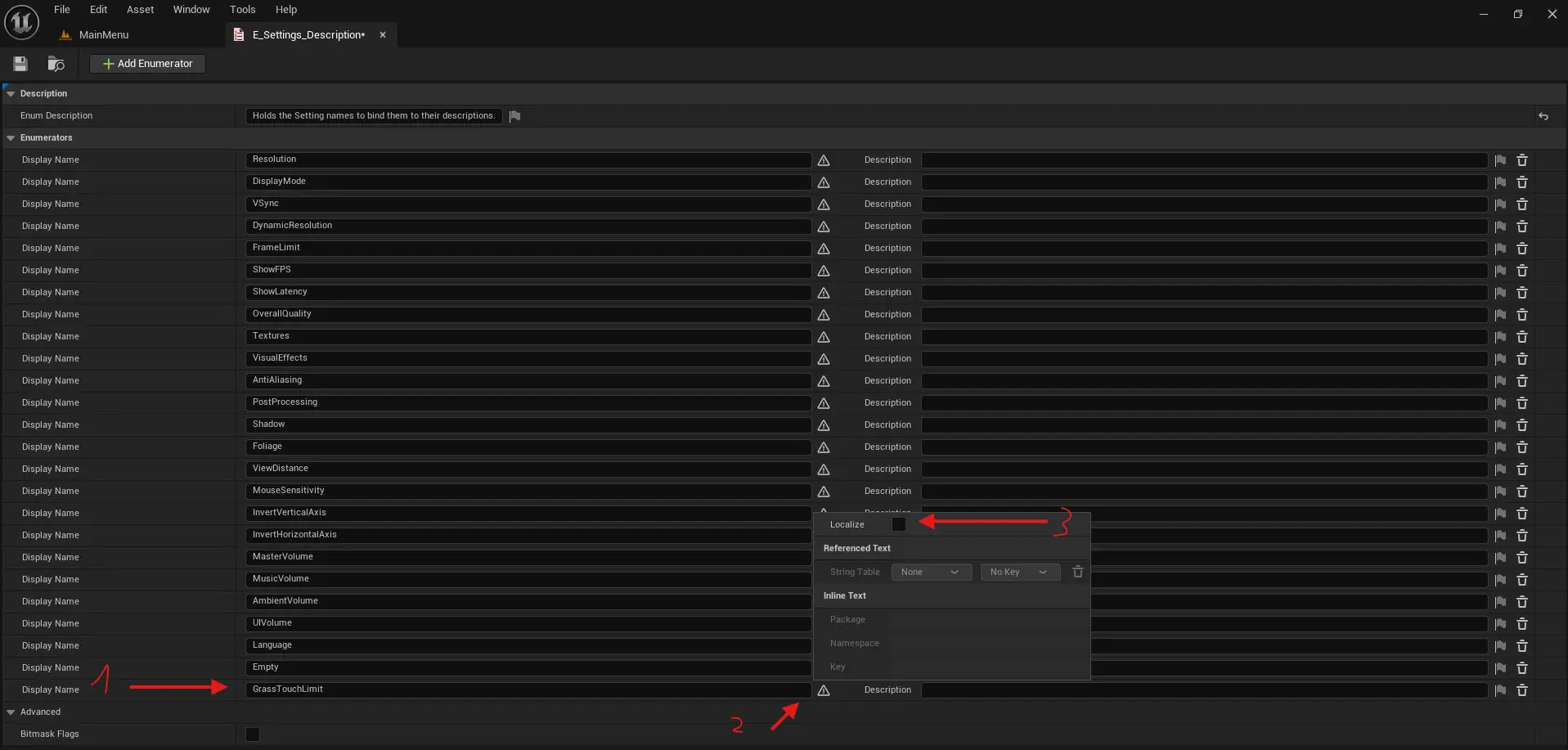
- Add a new enum to “E_Settings_Description” using the name of your setting. Don’t use any spaces or special characters in the name (those can still appear in the UI, just not in the enum itself).
- Click the small flag icon next to it to open the localization window.
- Uncheck “Localize” and save.
- Open “ST_Localization” and add a new row. For “Key”, use something descriptive like “Game_GrassTouchLimit”. For “Source String”, enter the name you want to show in the UI. These two values should not be the same. Then click “Add” on the right side to confirm the row and save it. (If you want to translate this setting, refer to the “Add a language (localization)” section in the documentation).
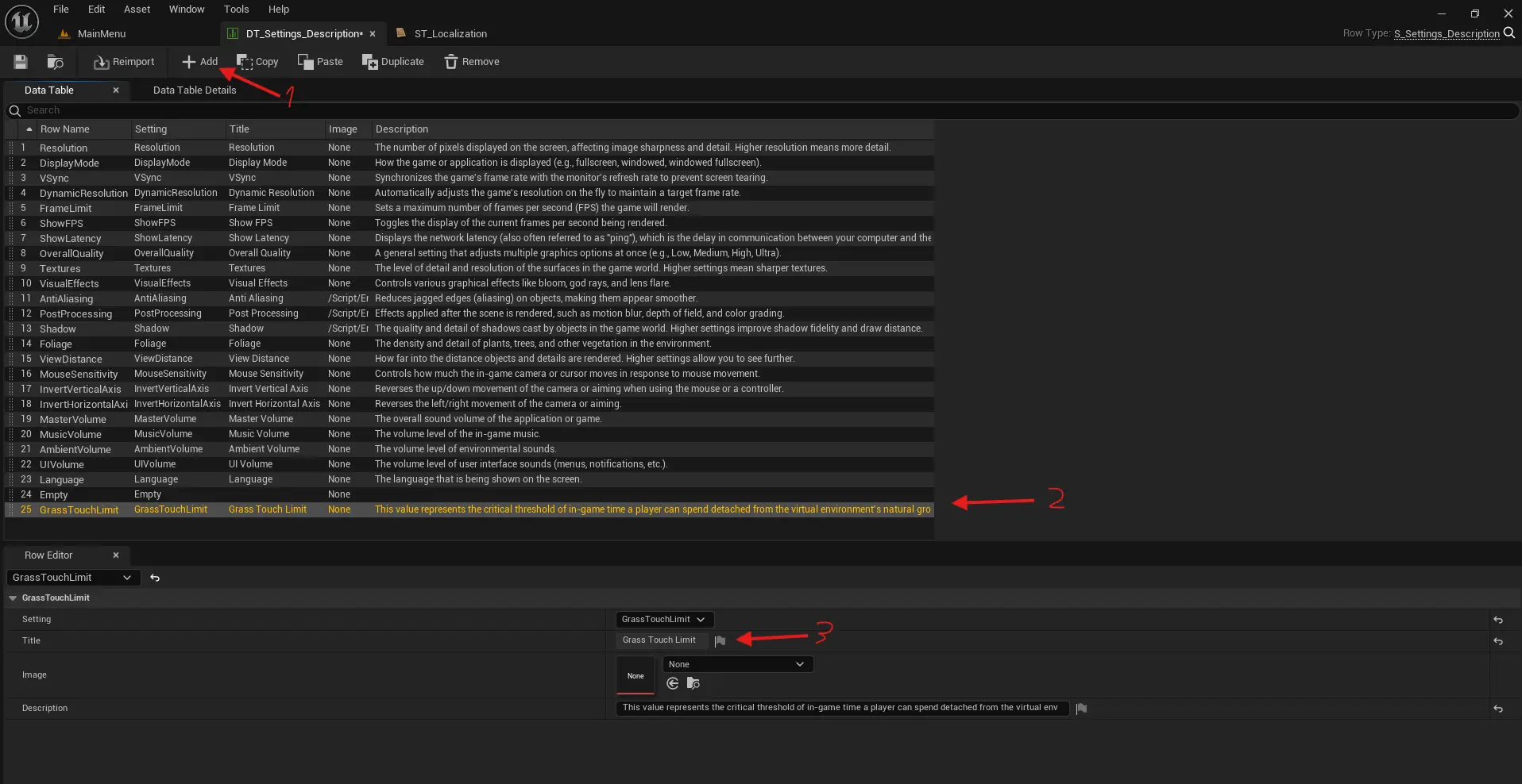
- Go to “DT_Settings_Description” and add a new row.
- Set “Setting” to the one you just created.
- Set “RowName” to match the “Setting” exactly.
- Click the flag icon next to the title, select “ST_Localization” as the “String Table”, and then choose the key you created in step 4. This should now show the display name, like “Grass Touch Limit”.
- You can also add an image and a description. I don’t have an image of grass at hand, unfortunately. It should then look like this:
- Open “AWBP_SettingsMenu”.
- Find the type of widget you want to use and add the template equivalent widget to the desired section. Here, I dragged a “WBP_Settings_Slider” to below “WB_DisplayMode” in the “Video” Section. I also pasted another spacer.
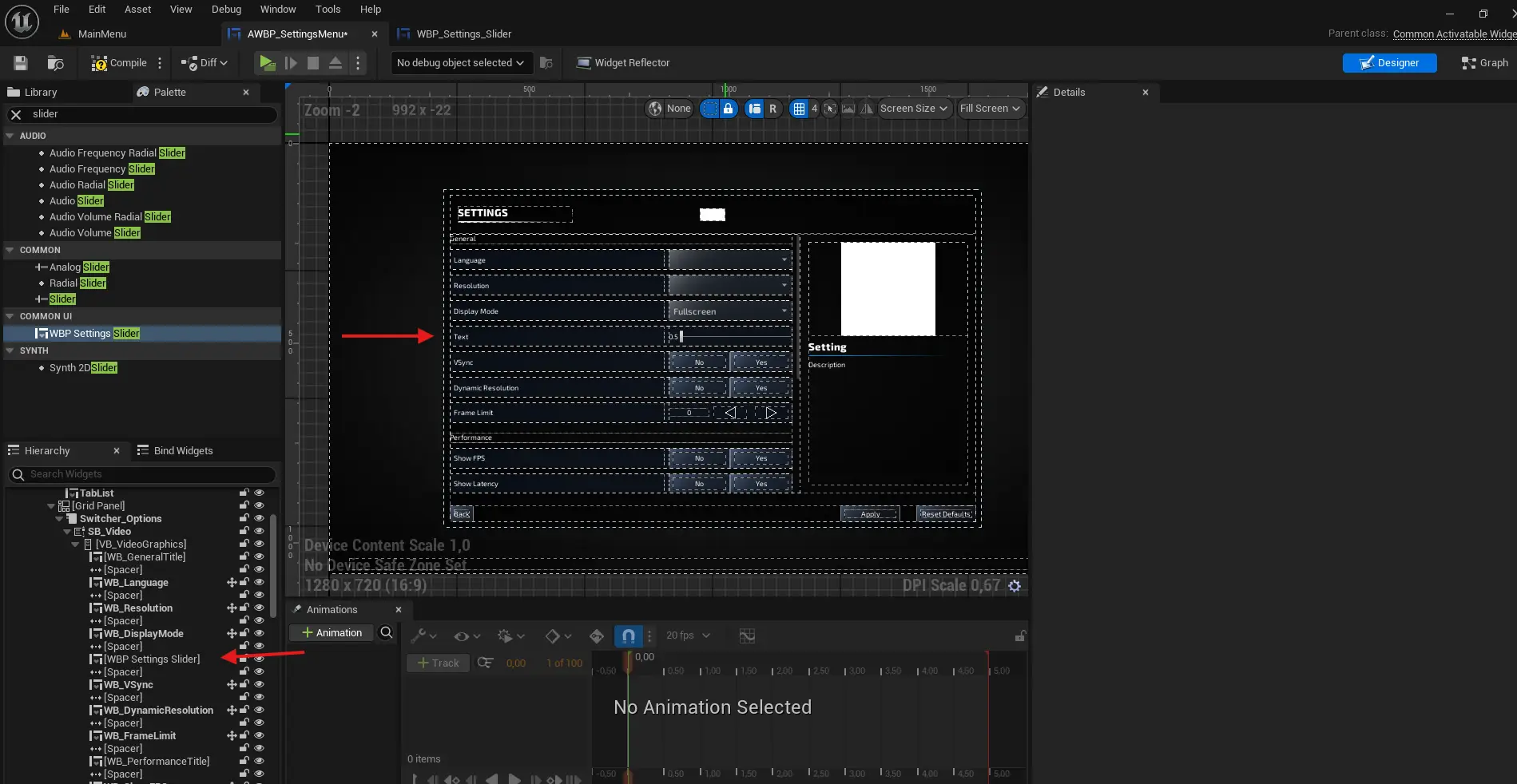
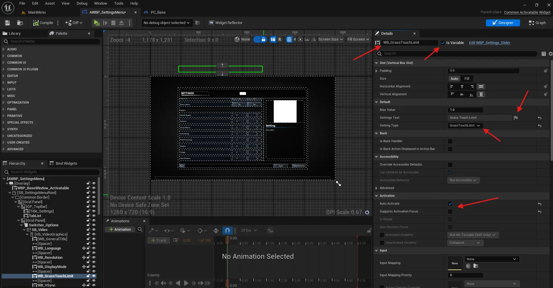
- Name it something like “WB_GrassTouchLimit” and assign the localization key you created to it’s “Settings Text” variable. Also, check “Is Variable”, uncheck “Supports Activation Focus”, check “Auto Activate” and set the “SettingType” value to the enum you created.
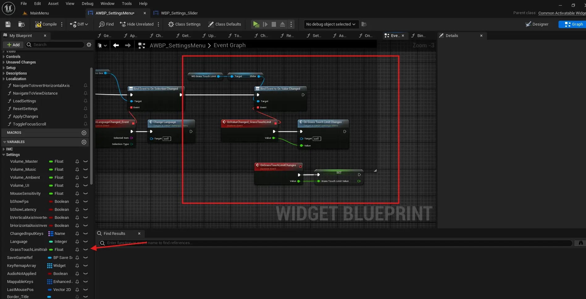
- Now for the Blueprint part. Go into the graph editor of the settings menu and scroll to the end of the “AssignWidgets” function (yes, the long one at the top).
- Drag the widget you’ve created into the event graph and get it’s slider/combo box or whatever input it uses.
- Bind custom events to the relevant dispatchers. You can copy these from a similar widget already in “AssignWidgets”.
- Give the custom event a cool name. I called it “OnValueChanged_GrassTouchLimit”. Very cool, I know.
- Anyways, create another event that defines what happens when the value changes. I called mine “OnGrassTouchLimitChanges”. Make sure it has the correct input types that match the outputs from the event you bound.
- Inside this new event, define what should happen when the value changes. In this case, I’ll just store the value.
- Create a variable with the same type as the input. I used a float and called it “GrassTouchLimitValue”. Consider adding it to the “Settings” category. Save it.
- You could use the “ApplySettings” event to apply the value, but in this case, nothing needs to happen there.
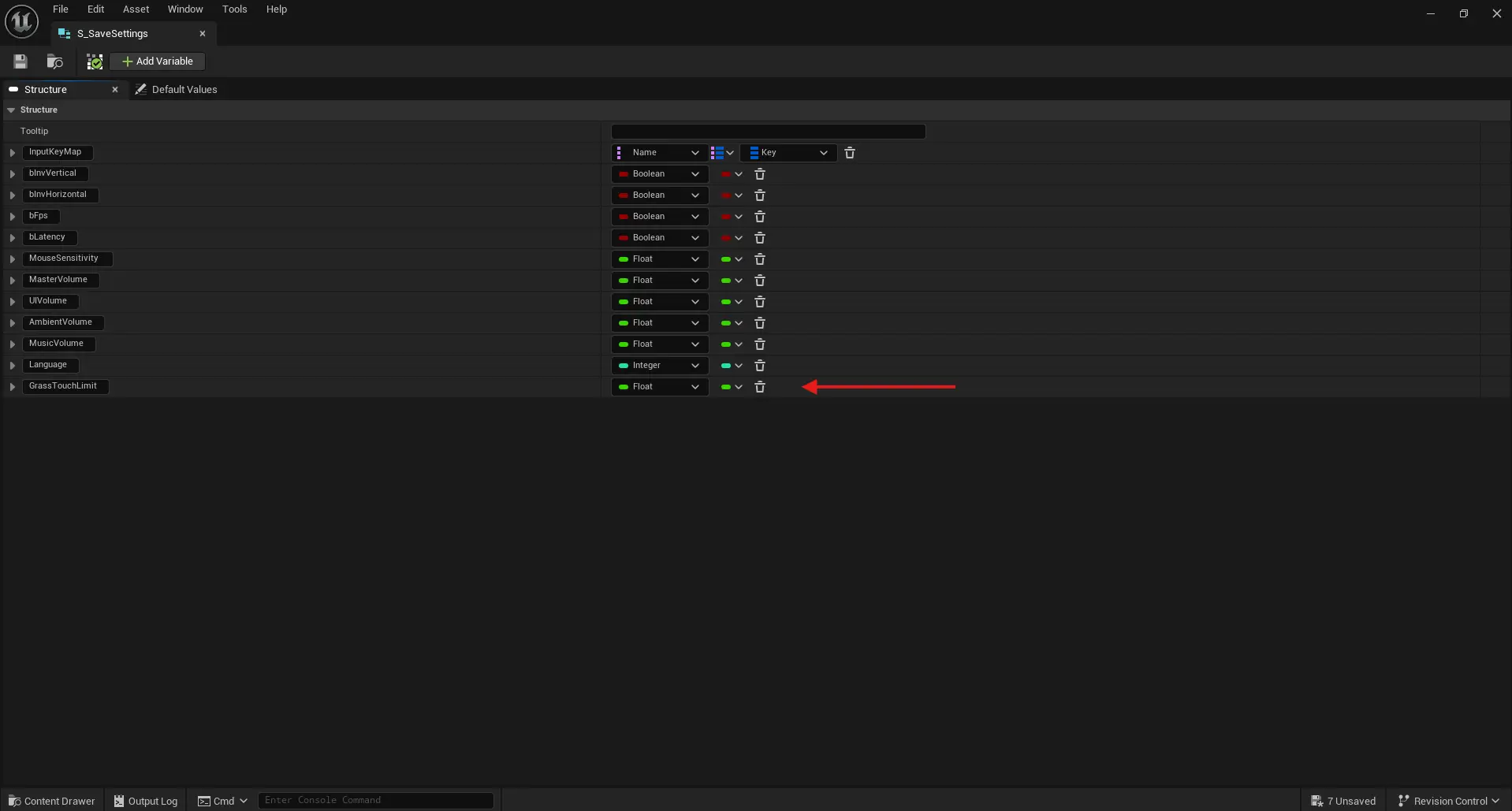
- However, we do want to save the value. Go to “S_SaveSettings” and add the new variable there. Save.
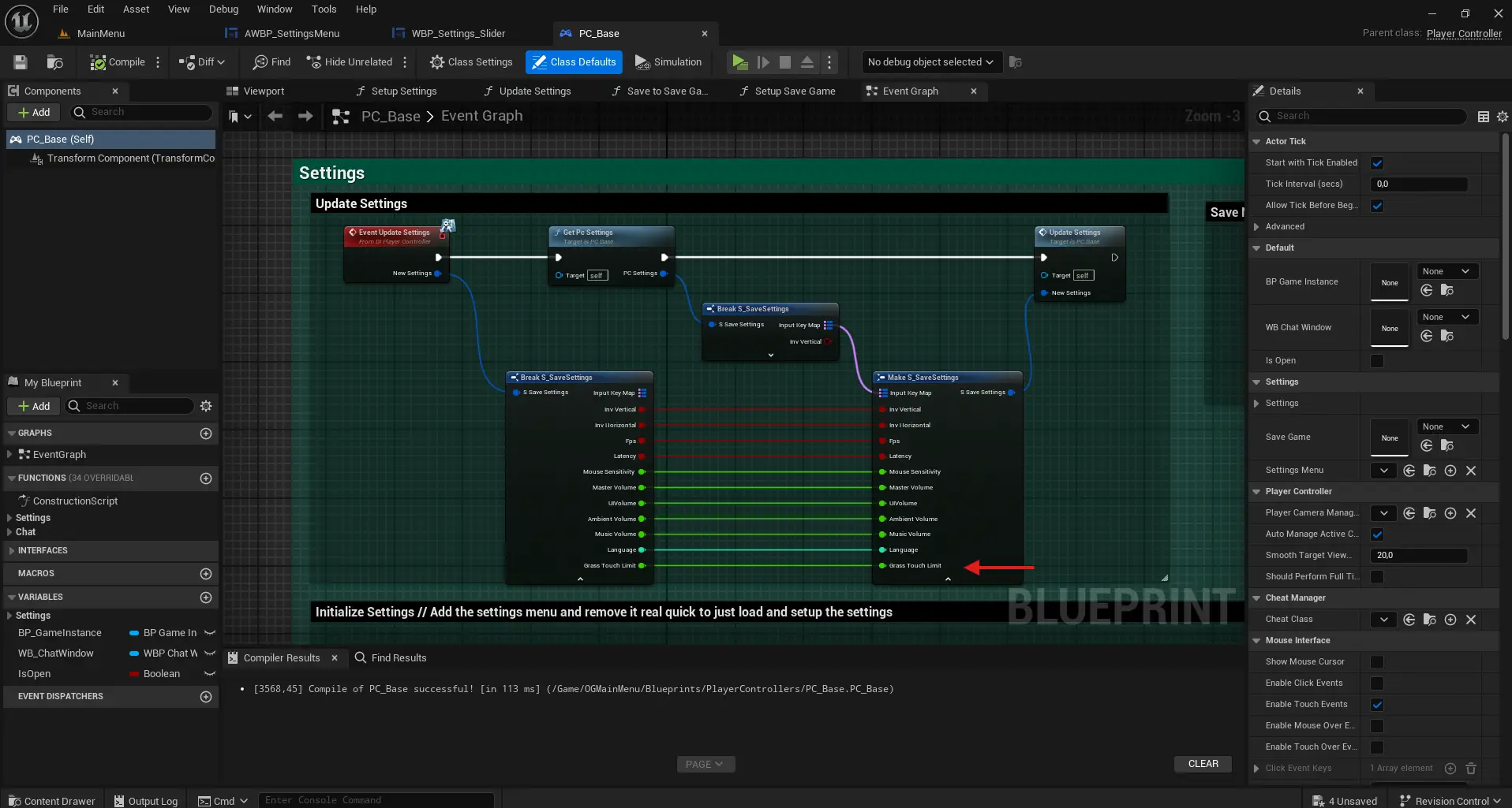
- Open “PC_Base” and connect the variable’s input and output in the “Event Update Settings” section.
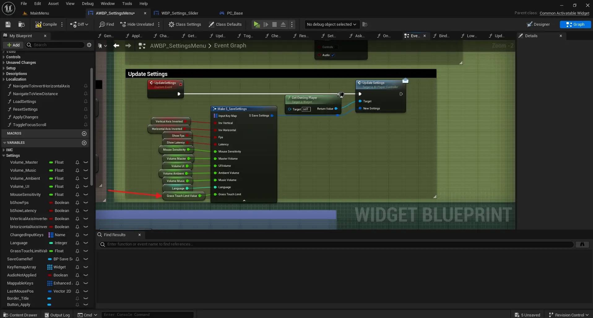
- Go back to “AWBP_SettingsMenu” and into the “UpdateSettings” event. Connect the variable here too.
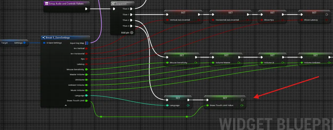
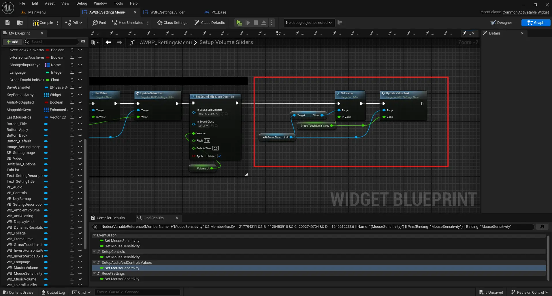
- Go to the function “Setup Audio and Controls Values” and assign the struct value to the variable.
- Then, in “Setup Volume Sliders”, assign the variable’s value to the actual slider.
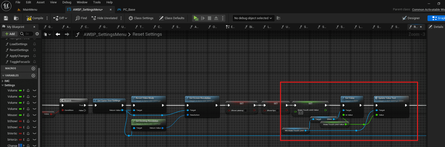
- Open “Reset Settings” and assign the variable a default value, like 0.3. Do this before calling “UpdateSettings”. Also assign the variable’s value to the slider here too (you might want to create a helper function for this).
- Go to the function “SetDefaultVideoQuality”, add a new pin to the sequence and set the default value of the variable there as well.
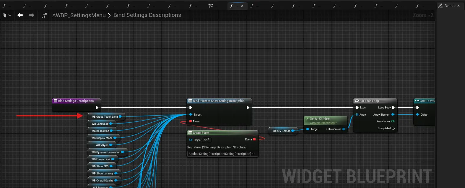
- Finally, go to “BindSettingsDescriptions” and connect your slider widget to the description binding.
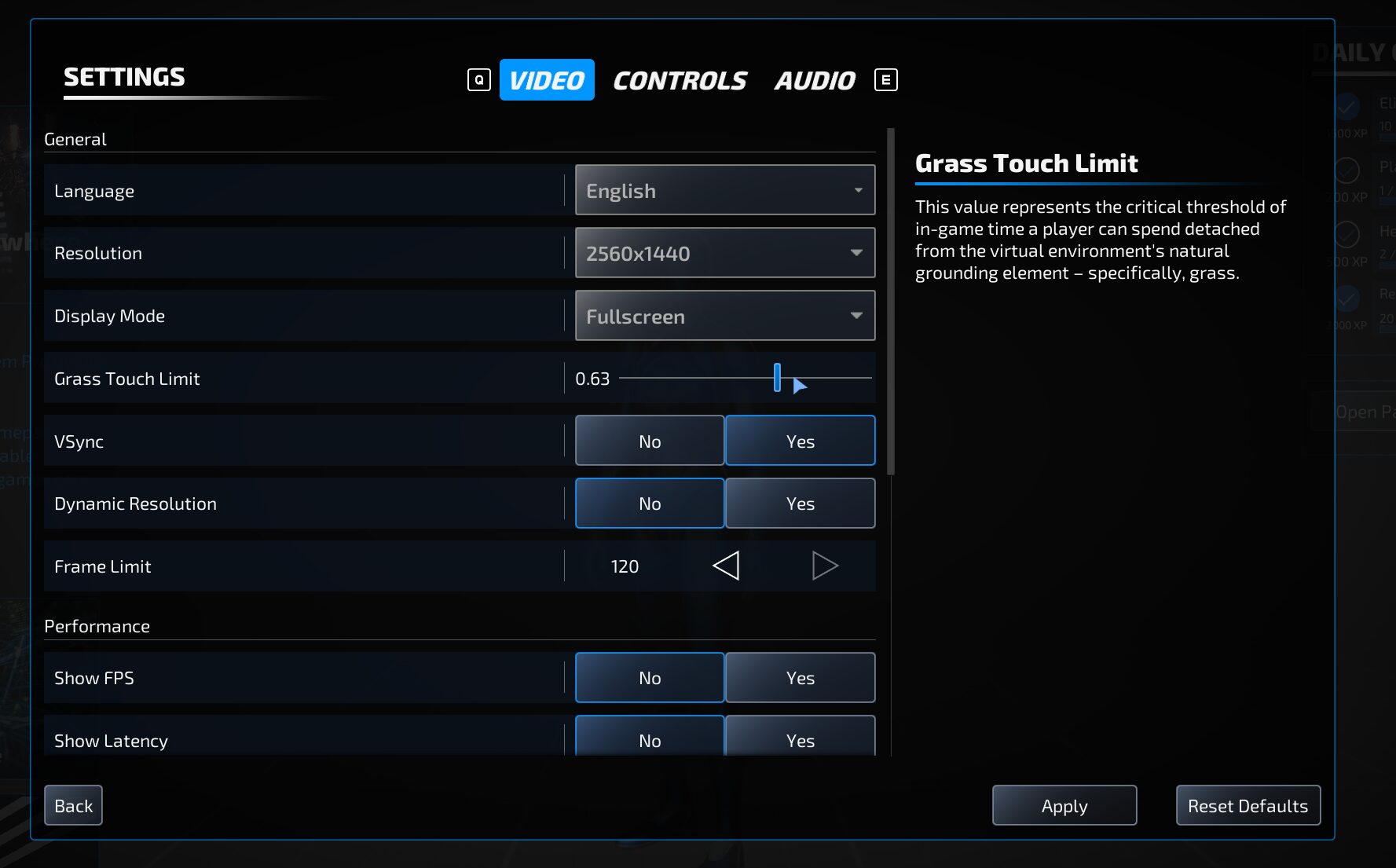
Now, displaying the setting with it’s description as well as editing, saving and resetting should work! That’s how mine looks:
Add a language
Alright, so let’s say you want to add spanish. Why spanish? Because I am prepping for my summer vacation. Anyways, you can choose the language you desire. Okay, let’s begin.
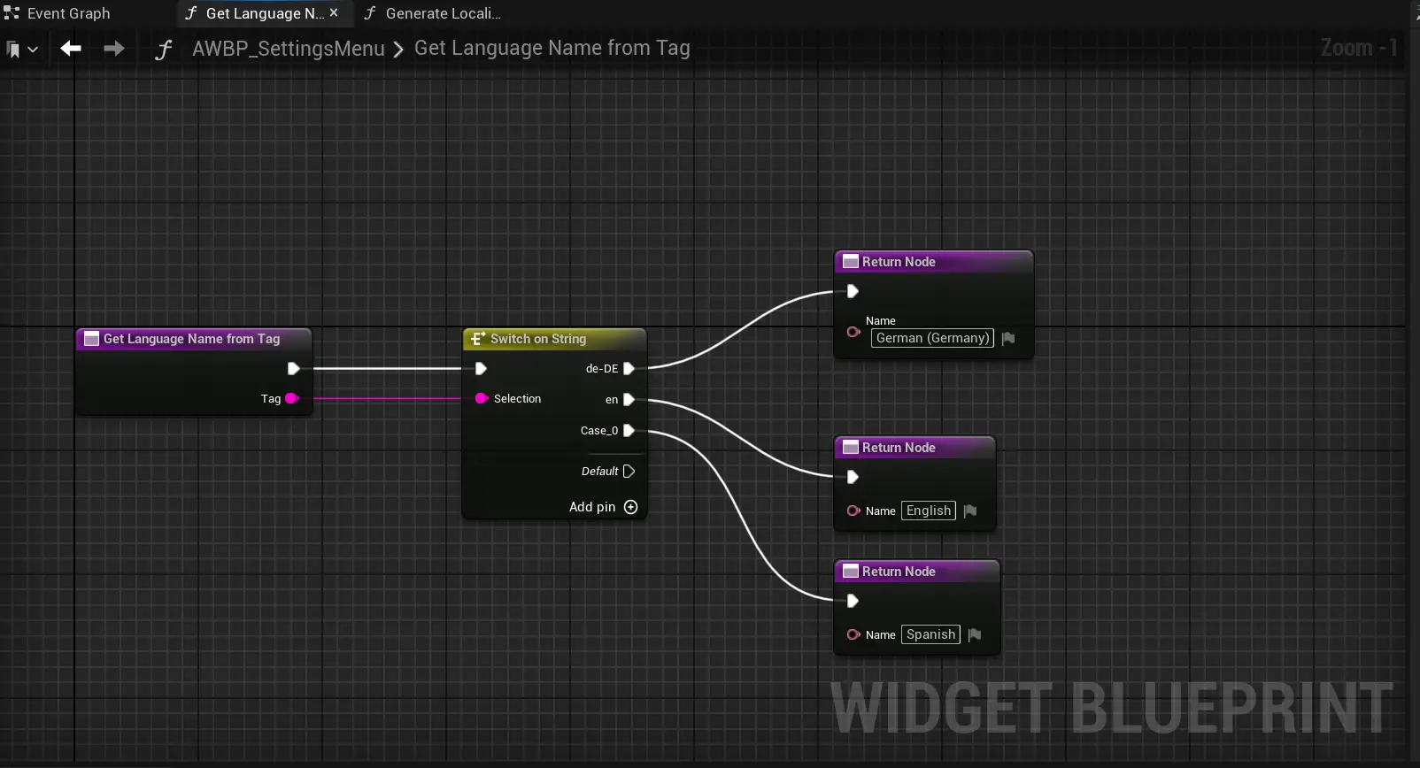
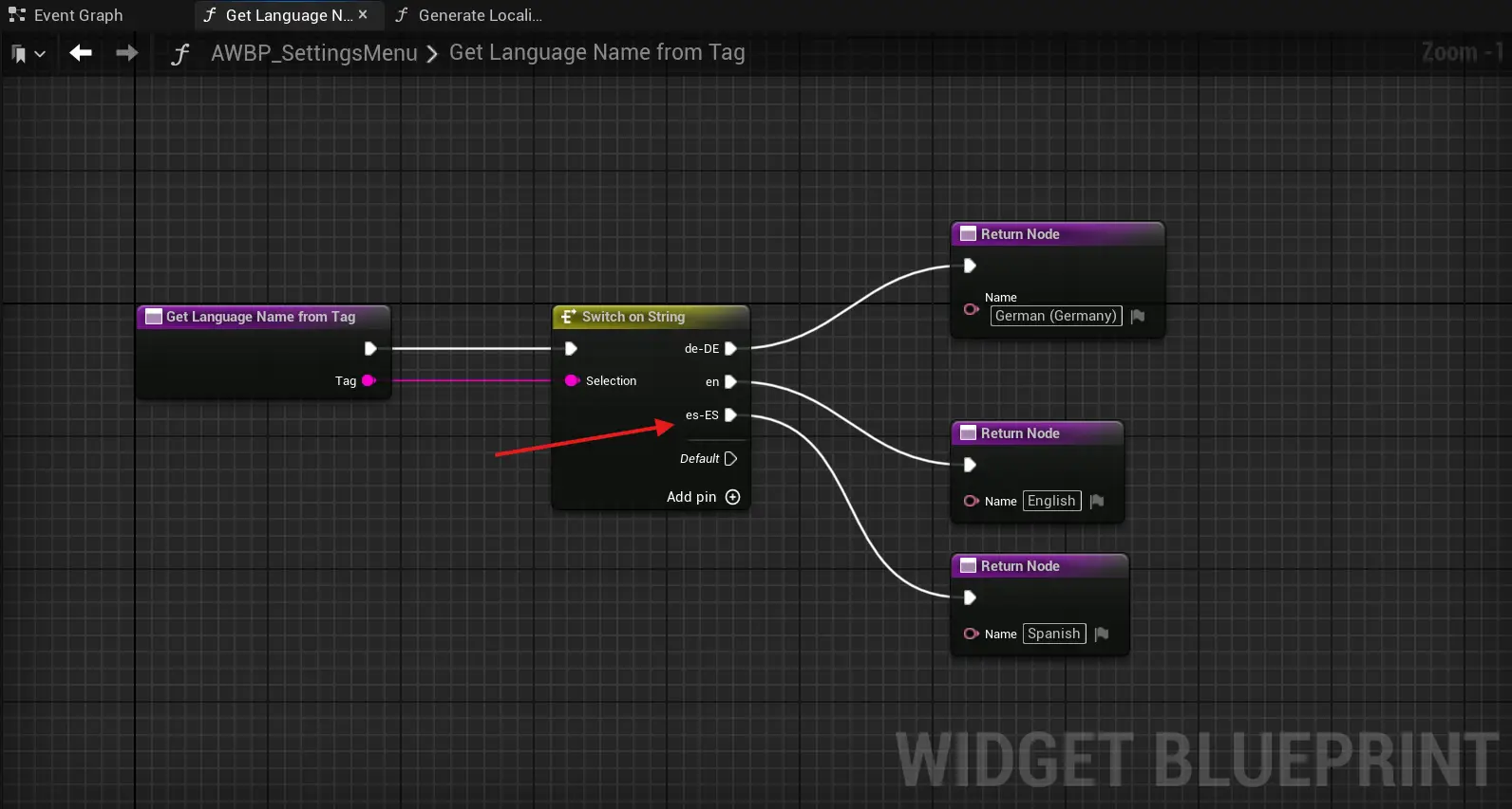
- Open “AWBP_SettingsMenu” and its”GetLanguageNameFromTag” function.
- Add another pin to the “Switch on String” node and connect it to a new “Return Node“. Leave the new pin’s input as it is for now.
- In the “Return Node“, set the output value to the English name of your chosen language.
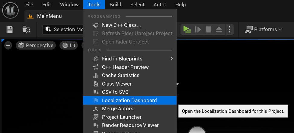
- Go to “Tools > Localization Dashboard” and open it.
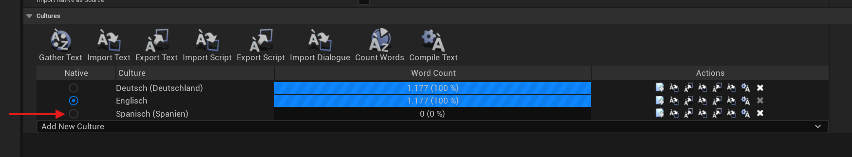
- Scroll to the very bottom and find the “Cultures” section. Click “Add New Culture“. Now search for the language you want to add (e.g., Spanish) and add it. The order of cultures doesn’t matter in our case.
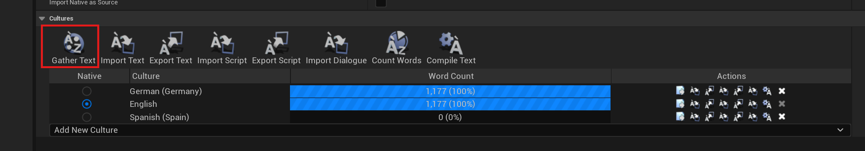
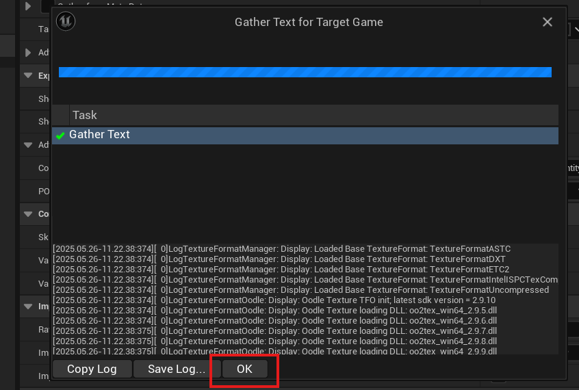
- Click “Gather Text” and wait for the process to finish.
- Click “Ok” when it’s done.
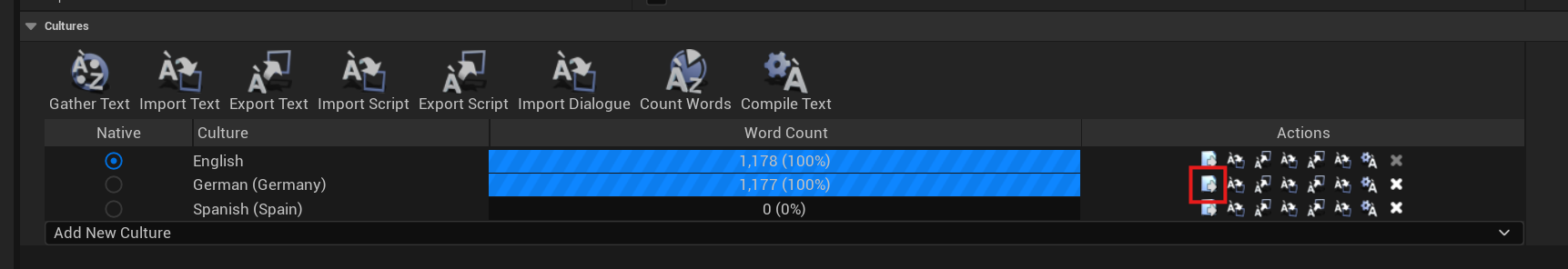
- Click “Edit Translations for this culture” next to the “German” culture.
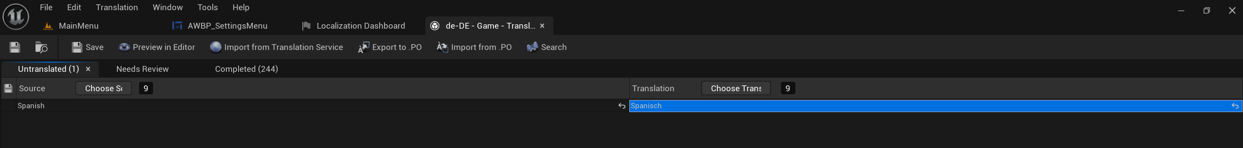
- Add the german translation for the language name you set in the settings function and save.
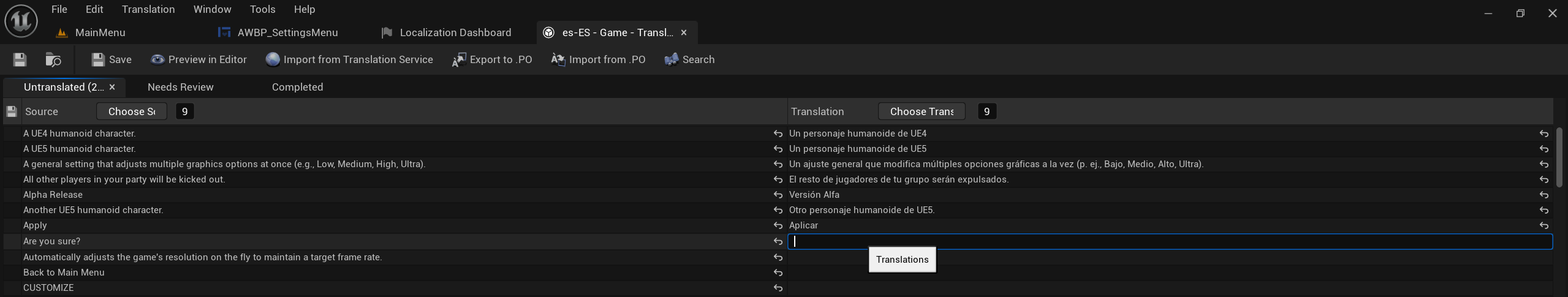
- Close the german translation window and open the one for your added language (e.g., spanish).
Add translations for each English string on the left. Here, I have to add the spanish translations. Either you do it here, or use the method in the next step.
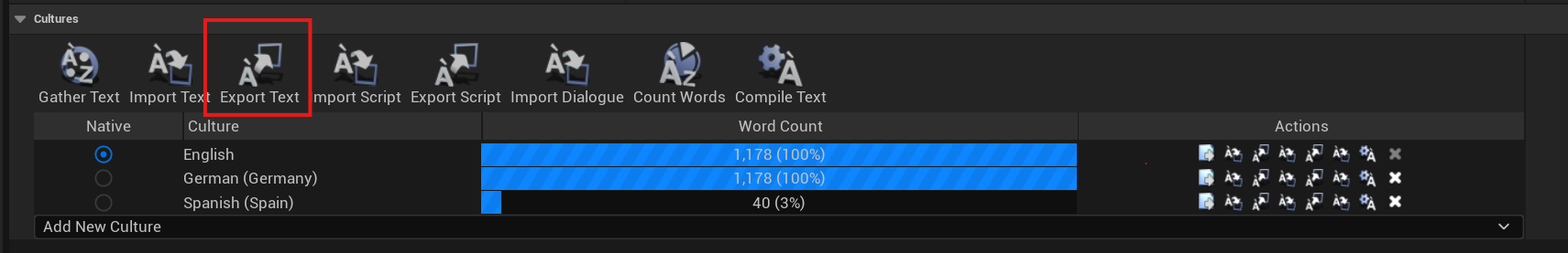
- You can also click on “Export Text” inside the Localization Dashboard. It should point to the “Game” folder inside “Content > Localization“. Keep it as that and click “select folder”.
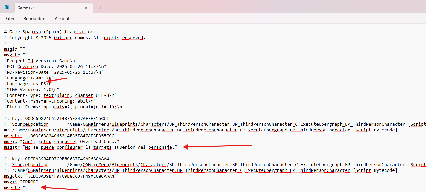
- In File Explorer, navigate to that exact Game folder into the folder of the language you still need to translate. Inside, you’ll find a “Game.po” file. Copy it to a separate folder to avoid modifying project files directly. You can open it in a text editor, or rename it to “.txt” for easier editing. Translate each “msgid” by writing the translation into the corresponding “msgstr“. here, I have only translated the first one and kept the second one as it is to show you how it looks unchanged.
- If you have translated the strings inside the editor, save and close the translation editing tab. If you did it in the file directly, just change it’s extension back to “.po” and replace the original inside “Content > Localization > Game > [your new language tag]“.
- Back in the Localization Dashboard, click “Import Text“.Make sure it still points to the “Game” folder.
- Click “Gather Text” again.You should now see blue progress bars for all cultures, each showing 100%. If not, check and complete any missing translations.
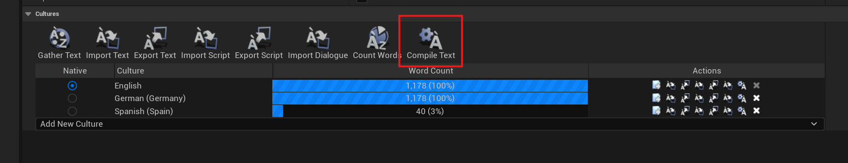
- Click “Compile Text“.
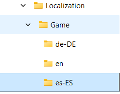
- In File Explorer, go to the Localization folder and copy the folder name of your new language. In my case it’s “es-ES”.
- Go back to the “Switch on String” node in the “Settings Menu” and paste that value as the input for the new pin. You might have to reconnect the pin to the “Return Node”.
- Run the game in Standalone Mode. You should now see your new language option in the settings, fully functional.
- NOTE: Runtime language switching does not work in PIE (Play-In-Editor) mode. If the language doesn’t show or you see duplicate “English” entries, recompile the text in the Localization Dashboard.
If you want to deepen your understanding of Localization, check out this video by LeafBranchGames on Localization.
Check it out: Localization (translation) – Unreal Engine 5 beginner tutorial
Version changes
v1.0.5 New UE Version, Feature Update and Bug fixes
A compatible version for Unreal Engine 5.7 has been added!
Bugs fixed:
FIXED Hover sound being played twice on Gamepad when changing tabs
Features implemented:
Compatible with UE 5.7
Show popup message when rebinding to key thats in use already
Focus on the chatbox when clicking on it instead of only when pressing enter
Reworked Loading Screen functionality. It’s hard to explain, just compare it to how it was before and you will notice a difference. ^^
Reworked “Push Widget to Stack” functionality
v1.0.4 Rebranding, Feature Update and Bug fixes
Project renamed to OG Main Menu System for a shorter and more recognizable identity.
Bugs fixed:
Fixed issue where the info box on the Character Screen did not wrap text properly.
Resolved keyboard focus being lost when opening and closing the chat window.
Fixed AWB_Modes widget error when hovering over opened modes. (5.6)
Main Menu Tabs no longer show hover state when not in focus.
Addressed flickering of the vertical line in the “Number of Players” section in the “Create Match” widget.
Features implemented:
Pop-Up Message repositioned to the right side and now includes an animation to avoid covering tab navigation.
Equipped Skin button now displays “Equipped” and is disabled when the currently viewed skin is already equipped.
v1.0.3 Bug fixes
v1.0.2 Bug fixes
v1.0.1 Feature Update
- Keyboard Navigation
- Localization
- Setting Descriptions
Also, some bugs were fixed for a more stable and polished experience.
v1.0.0 Launch version
UE 5.3 and UE 5.4:
Don’t have any distinct differences
UE 5.5:
Has a bug with Widgets Components not being displayed on the server side if they are directly attached. That’s why instead the Character class has a child actor which has the widget component attached to it, in the 5.5 version.
Tutorials
Resources
Unreal Garden (Has lots of awesome UI tutorials that cover the industry standard)
MrButier (Does the best Common UI tutorials in my opinion)