General Information
All non self-explanatory blueprint classes and most functions or blueprint graphs in general, have a green comment within them that explain what the class is for and possibly how it works. Also all events are inside comments to make the overview a bit easier as well as a convenience in finding a specific event when looking at a blueprint graph due to the comment title (and bubble) being larger than the event title. The blue comments hold interface events.
Also, all blueprints, variables and functions contain descriptions either through comments or through the descritption field in the details panel.
You’ve probably noticed that almost all files are inside the OGMFB folder instead of directly in the Content folder. This template was made to be used as the “main” project due to having multiple project settings set up BUT that parent folder makes migrating parts of the template into your own project (or the other way around) much cleaner. In most cases, folders like “Characters” or “GameModes” already exist, and mixing them with template content can get messy fast. If you do want everything in one place, feel free to move the files after migrating. If not, no need to thank. Just smile, nod, and enjoy the folder structure.
Common UI
Overview
You will notice throughout the template that the widgets do not inherit from “User Widget” but instead from “Common User Widget” and “Common Activatable Widget”. That’s due to a default plugin called “Common UI” which was used for the UI and builds the foundation for any modern Unreal Engine high-quality game. It’s also the primary UI system behind my other templates OG Main Menu System and OG Roguelike Mobile Kit.
Citing the Unreal Engine Common UI Documentation:
“Common UI supports the development of cross-platform UIs with complex navigation, such as menus with layers, submenus, or popups. Originally developed for UI in Fortnite, this plugin is available to Unreal Engine users through the Plugins menu.”
How we use it
Common UI offers plenty of functionality but in this Kit it will be used for 2 reasons.
First, this makes it very easy to have multiple layers and focusing on the top most “leaf”. This is elaborated further in the Common Activatabale Widget section.
Second, Common Text/Border Syles and Common Base Buttons.
Activatable Widgets
Within Common UI, only certain widgets are converted into nodes for the purpose of handling input, and only widgets that are ready to handle input receive input. These widgets are called activatable widgets, and they are considered “active” if they are ready to receive input.
Activatable widgets help manage input flow, especially in overlays. If an overlay widget is dismissed, CommonUI ensures that input is routed to the next active widget, even if it’s on a lower UI layer. Only the topmost active leaf receives input at any time, so lower layers don’t need to worry about being inactive if they’re still in use.
Throughout the template, you will notice widgets inheriting from the Common Activatable Widget class. Widgets inheriting from this class usually aren’t created like normal User widgets usually would. Instead they get pushed on Stack layers and become active by doing so. For your convenience, all activatable widgets in this kit have an “AWBP_” prefix.
Layers in Common UI
In this template, different types of UI content are managed by specific layers. Each layer represents a stack of widgets that can be pushed or popped/deactivated to control which UI elements are visible at a given time.
The layer structure used in this template consists of:
- Game: For HUD, Main Menu and similar elements which kind of take the “main UI” role.
- Menu: For the Pause Menu or other windowed screens.
- Modal: For overlays like Pop-Up windows. (Not used in this kit but exists for your convenience 😉 )

When a widget is pushed onto a layer with existing content, it replaces the current widget until it is deactivated (popped off). For example, pushing a new UI element onto the GameUI layer replaces the old one.
Each layer operates as a separate stack, so when a new widget is pushed onto a higher layer (e.g., Menu), the layers below it remain visible. This allows for flexible, non-overlapping UI structures. This means that there can be 4 Activatabale Widgets active at the same time. One for each layer.
Common User Widgets
They do offer some extra functionality but here they are being used as if they were simple user widgets. This way, if you wanted to extend on the Common UI functionality, you could without having to reparent or recreate widgets.
Common Styles
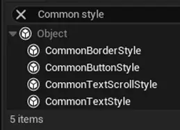
CommonUI comes with its own set of widgets, found under the Common UI Plugin section in the UMG Palette. Unlike regular UMG widgets, these don’t have built-in styling options. Instead, they use Common Style Assets to control appearance.
You’ll find the style assets of the OG Mobile Flapping Bird in the CoreUI folder. Changing a style asset updates every CommonUI widget that uses it. For example, if you update the color of a CommonBorderStyle asset, all widgets using that Common Border style will update automatically, making it easy to keep your UI consistent.
You can create new style assets by creating a Blueprint of the Style type that you want as you can see in the following image.
For More information, checkout the Common UI Quickstart Documentation.
Architecture
Gameplay Tags
Gameplay tags are the main foundation of the architecture in this kit. For those who don’t know what gameplay tags are, take a look at this article in the documentation.
In short, gameplay tags can be added and removed in the project settings and can be accessed in the entire project. They’re basically like actor tags, just hierarchical, accessible from everywhere, and much more consistent since there can’t be any typos—they’re defined in one place only.
In this kit, they’re used for identifying skins like “Skin.YellowBird” and UI layers as part of Common UI like UI.Base.Modal. They’re very lightweight and make the life of a UE dev much easier.
Optimization
Unlike computers, mobiles usually have much less hardware power nowadays. That’s why a big focus in development was optimization.
You’ll come across a number of comments in the kit that talk about how certain parts are optimized, but here are a few things that were done. First, soft references were used wherever it made sense. Furthermore, tick is disabled on all actors and components where it’s not needed.
In addition, a pooling mechanism was developed to avoid repeatedly spawning and destroying pipe actors, which is very expensive. Instead, a specified amount of pipe actors that can be on screen at the same time are spawned at the start of a game and are being resetted to the right each time they collide with a collision box on the left outside the screen. So pooling basically recycles actors.
UI
WBP_CmnUI
The “WBP_CmnUI” widget is the core widget which holds the stack layers onto which all activatable widgets get pushed on. To understand better what stack layers are, checkout the section on Layers in Common UI!
Additionally, this class handles pushing and removing widgets. This is handled by utilizing gameplay tags, one for each stack layer, then giving it over as an input through that function call, test which tag was given over and push the widget on the appropriate stack layer.
Game
Pipes
Each top and bottom pipe in the game form one “BP_Pipe”. Pipes are being handled by the GameState and initially get spawned on the right side of the screen.
Their speed is set inside the “ProjectileMovement” component and each time they collide with a collision box on the left side outside of the screen, they reset to the right. When resetting, they have a chance (defined in GS_FlappingBird) to have a coin which the player receives when passing through. These coins can be found in the center of a pipe actor. If a pipe actor has a coin or not is randomly set each time the pipe is resetted to the right of the screen. By default, there are 10 pipes being spawend so each 10th pipe you come across is the same, just in a different position.
Skins
There are 3 skins inside the game that can be bought with coins that were earned while playing. The first one, Yellow Bird, is unlocked by default. The Green and Red Bird skins need to be bought in the menu.
The last selected & unlocked skin in the menu is the one that’s saved as the “current skin” which gets spawned when playing the game. That logic happens inside “WBP_Customization”.

Coins
Coins can be earned through collecting them in-game. They can be found in the center of a pipe actor. If a pipe actor has a coin or not is randomly set each time the pipe is resetted to the right of the screen.
Version Changes
V1.0.0.0
Initial Launch version.