General Information
All non self-explanatory blueprint classes and most functions or blueprint graphs in general, have a golden comment within them that explain what the class is for and possibly how it works. Also all events are inside comments to make the overview a bit easier as well as a convenience in finding a specific event when looking at a blueprint graph due to the comment title (and bubble) being larger than the event title. The blue comments hold interface events.
Also, all blueprints, variables and functions contain descriptions either through comments or through the descritption field in the details panel.
You’ve probably noticed that almost all files are inside the OGRMK folder instead of directly in the Content folder. This template was made to be used as the “main” project due to having multiple project settings set up BUT that parent folder makes migrating parts of the template into your own project (or the other way around) much cleaner. In most cases, folders like “Characters” or “GameModes” already exist, and mixing them with template content can get messy fast. If you do want everything in one place, feel free to move the files after migrating. If not, no need to thank. Just smile, nod, and enjoy the folder structure.
Common UI
Overview
You will notice throughout the template that the widgets do not inherit from “User Widget” but instead from “Common User Widget” and “Common Activatable Widget”. That’s due to a default plugin called “Common UI” which was used for the UI. It’s also the primary system behind my other template OG Main Menu System.
Citing the Unreal Engine Common UI Documentation:
“Common UI supports the development of cross-platform UIs with complex navigation, such as menus with layers, submenus, or popups. Originally developed for UI in Fortnite, this plugin is available to Unreal Engine users through the Plugins menu.”
How we use it
Common UI offers plenty of functionality but in this Kit it will be used for 2 reasons.
First, this makes it very easy to have multiple layers and focusing on the top most “leaf”. This is elaborated further in the Common Activatabale Widget section.
Second, Common Text/Border Syles and Common Base Buttons.
Activatable Widgets
Within Common UI, only certain widgets are converted into nodes for the purpose of handling input, and only widgets that are ready to handle input receive input. These widgets are called activatable widgets, and they are considered “active” if they are ready to receive input.
Activatable widgets help manage input flow, especially in overlays. If an overlay widget is dismissed, CommonUI ensures that input is routed to the next active widget, even if it’s on a lower UI layer. Only the topmost active leaf receives input at any time, so lower layers don’t need to worry about being inactive if they’re still in use.
Throughout the template, you will notice widgets inheriting from the Common Activatable Widget class. Widgets inheriting from this class usually aren’t created like normal User widgets usually would. Instead they get pushed on Stack layers and become active by doing so. For your convenience, all activatable widgets in this kit have an “AWBP_” prefix.
Layers in Common UI
In this template, different types of UI content are managed by specific layers. Each layer represents a stack of widgets that can be pushed or popped/deactivated to control which UI elements are visible at a given time.
The layer structure used in this template consists of:
- Game: For HUD, Main Menu and similar elements which kind of take the “main UI” role.
- GameUI: For gameplay-related widgets (e.g., Skill Selection).
- Menu: For settings or other windowed screens.
- Modal: For overlays like Pop-Up windows.
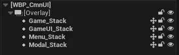
When a widget is pushed onto a layer with existing content, it replaces the current widget until it is deactivated (popped off). For example, pushing a new UI element onto the GameUI layer replaces the old one.
Each layer operates as a separate stack, so when a new widget is pushed onto a higher layer (e.g., Menu), the layers below it remain visible. This allows for flexible, non-overlapping UI structures. This means that there can be 4 Activatabale Widgets active at the same time. One for each layer.
Common User Widgets
They do offer some extra functionality but here they are being used as if they were simple user widgets. This way, if you wanted to extend on the Common UI functionality, you could without having to reparent or recreate widgets.
Common Styles
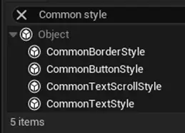
CommonUI comes with its own set of widgets, found under the Common UI Plugin section in the UMG Palette. Unlike regular UMG widgets, these don’t have built-in styling options. Instead, they use Common Style Assets to control appearance.
You’ll find the style assets of the OG Roguelike Mobile Kit in the CoreUI folder, under the subfolders Button, Borders, and Text. Changing a style asset updates every CommonUI widget that uses it. For example, if you update the font of a CommonTextStyle asset, all CommonText widgets using that style will update automatically, making it easy to keep your UI consistent.
You can create new style assets by creating a Blueprint of the Style type that you want as you can see in the following image.
For More information, checkout the Common UI Quickstart Documentation.
Architecture
Gameplay Tags
Gameplay tags are probably the main foundation of the architecture in this kit. For those who don’t know what gameplay tags are, take a look at this article in the documentation.
In short, gameplay tags can be added and removed in the project settings and can be accessed in the entire project. They’re basically like actor tags, just hierarchical, accessible from everywhere, and much more consistent since there can’t be any typos—they’re defined in one place only.
In this kit, they’re used for identifying skills like Skill.Hero.Passive.HotSauce, game levels like Level.Ch01.Lv01, buffs and debuffs, items like Item.Boots.Golden, and UI layers as part of Common UI like UI.Base.Modal. They’re very lightweight and make the life of a UE dev much easier.
Game Instance
The Game Instance is probably the most important Blueprint in the entire Kit. It handles loading saved data from Save Game files so other assets can access it, and saves data whenever something changes. It also manages all the logic for player level ups and the Rewards system. Since you can earn rewards both in-game and in menus, and need to keep them when changing levels or maps, the Game Instance is perfect for this, it’s the only class that doesn’t get destroyed when switching levels/maps.
The Game Instance itself doesn’t reference many assets. Instead, other assets get data from it through interfaces or casting, depending on what makes the most sense.
Optimization
Unlike computers, mobiles usually have much less hardware power nowadays. That’s why a big focus in development was optimization.
You’ll come across a number of comments in the kit that talk about how certain parts are optimized, but here are a few things that were done. First, soft references were used wherever it made sense. Furthermore, tick is disabled on all actors and components where it’s not needed.
In addition, a few pooling mechanisms were developed to avoid repeatedly spawning and destroying actors, which is very expensive. Instead, a specified amount of actors that can be on screen at the same time are spawned at the start of a game. Also, by splitting the spawning across two or more ticks, we minimize the risk of hitches at the start of the game. So pooling basically recycles actors.
An example of this are the XP points that enemies drop. Damage indicator widgets also have this mechanism implemented. Both qualify for this approach since they have little change per use. In one the color and XP amount changes, and in the other just the number and possibly the color.
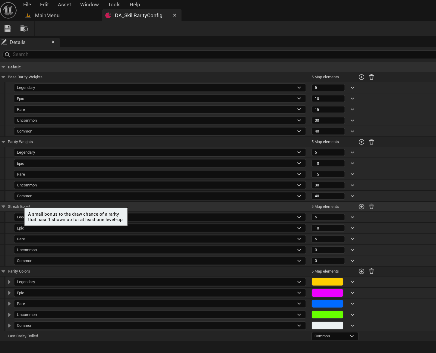
Rarities
You will come across these 5 rarities when playing the game or using the kit:
Common, Uncommon, Rare, Epic and Legendary.
All of these have an own set of Common Border Styles set up for them that make them have consistant colors across the entire project.
In addition to just colors, they play an important role in item level up multiplicators and define the chance that an item of that rarity is pulled when leveling up or when opening a chest.
UI
WBP_CmnUI
The “WBP_CmnUI” widget is the core widget which holds the stack layers onto which all activatable widgets get pushed on. To understand better what stack layers are, checkout the section on Layers in Common UI!
Additionally, this class handles pushing and removing widgets. This is handled by utilizing gameplay tags, one for each stack layer, then giving it over as an input through that function call, test which tag was given over and push the widget on the appropriate stack layer.
Main Menu
The dependencies in the Main Menu are pretty straight forward. The primary Main Menu widget is called “AWBP_MainMenu” and essentially holds all its tabs like “AWBP_BattleMenu”, “AWBP_ShopMenu” etc. . These hold references to their sub-widgets and so on. There is almost never a circular dependency.
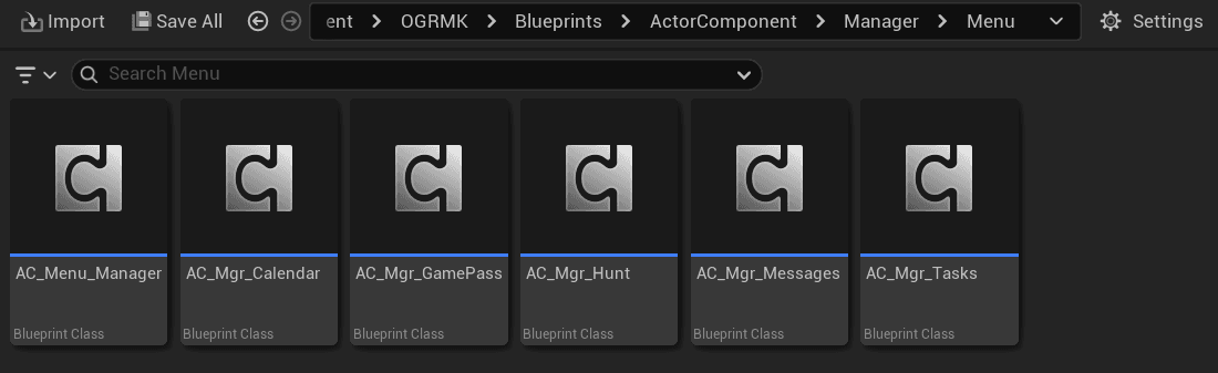
Menu Feature Managers
Features like the calendar, AFK Hunt, and Tasks use Actor Components attached to “HUD_MainMenu” to handle their logic. These components inherit from “AC_Menu_Manager”. When the game starts, they get data from the Game Instance, which loads it from Save Game files. Their only job is to fetch information from the Game Instance and show it on widgets. Following the standard pattern, widgets reference the Actor Components, not the other way around. You can spot these managers by their “AC_Mgr” prefix, which stands for Actor Component Manager.
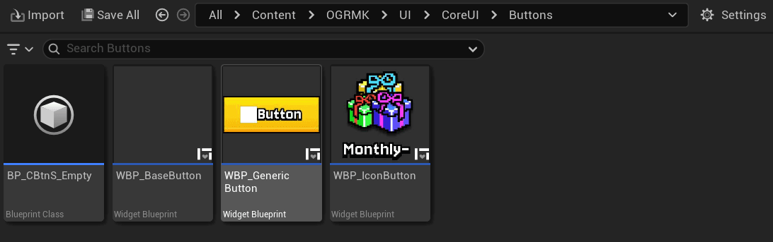
Buttons
Pretty much all Buttons inherit either from “WBP_BaseButton”, “WBP_GenericButton” or “WBP_IconButton”. The last two inherit from “WBP_BaseButton” as well which handles things like darkening the button while pressed. These button widgets are designed to be very customizable and allow for various styles.
Windows
Almost all Windows inherit from “AWBP_BaseWindow”. It’s also designed to be as customizable as possible. No matter what you want to change… the background, size, Title, Title type, Outline etc. . You name it.
Game
Maps
When a player presses play in the main menu, the selected level and its chapter are stored in the Game Instance. Then the game opens the Chapter Map.
Chapters are persistent levels, and the actual level loads based on what the Game Instance passed along. Technically, since all chapters are the same size, you could add all levels to every chapter. However, this setup allows for maps of different sizes or maps with areas that can’t be walked on.
Enemy Spawning
Enemy Spawning was designed to be as convenient and simple to set up as possible. It consists of just 3 steps.
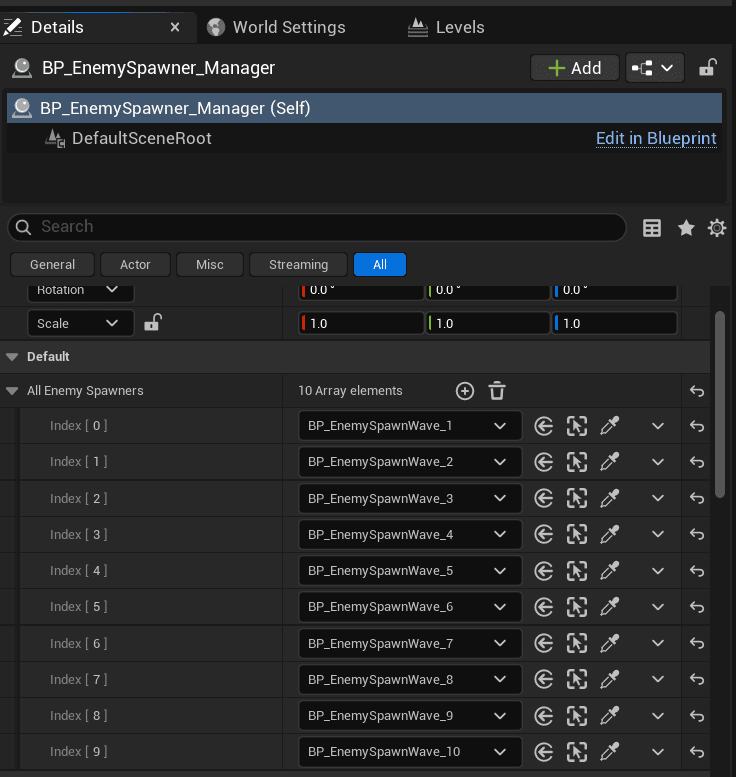
First, make sure you have the level active and not the persistent level. Then add as many “BP_EnemySpawnWave” actors as you have waves in the level. This is the first level of the first chapter, so it has 10 waves.
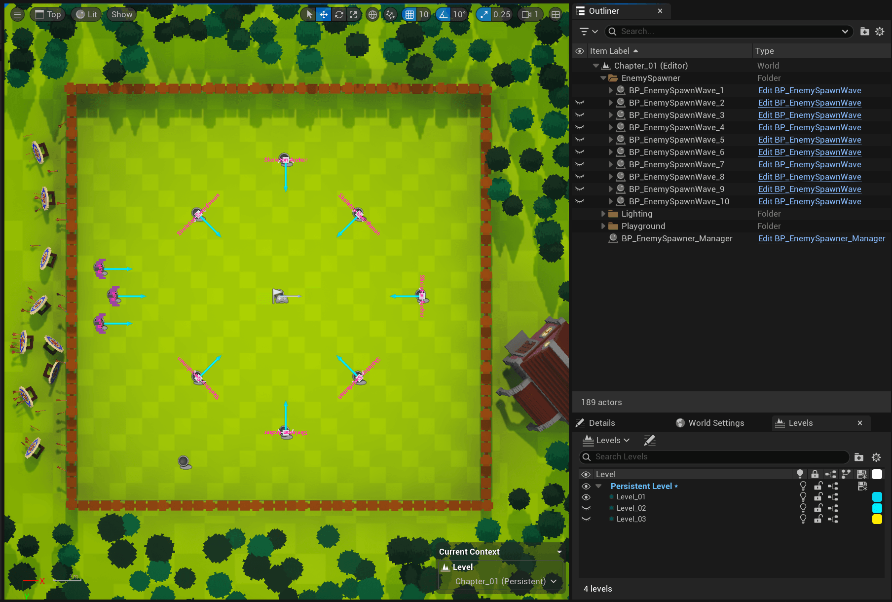
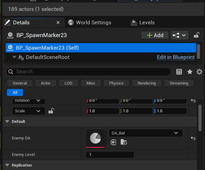
Second, for each enemy you want in this wave, add a “BP_SpawnMarker” as a child to the wave actor and position it wherever you want. You can change the enemy type and level by selecting the Spawn Marker actor and opening the details panel. There you can pick the enemy’s Data Asset and set its level. The enemy’s mesh and name appear in the level to make setup easier.
Last, add a “BP_EnemySpawner_Manager” and add all the waves to its “All Enemy Spawners” array in the order you want them to spawn.
Characters
Attributes
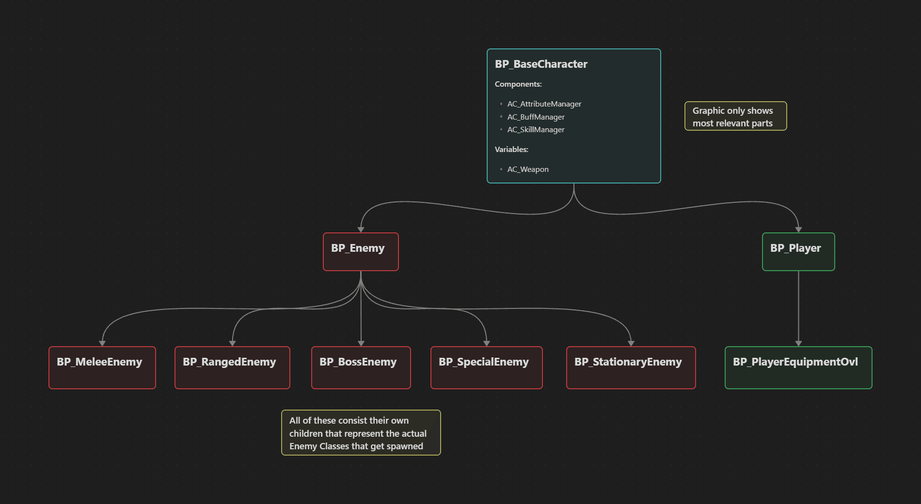
All logic regarding attributes is handled by “AC_AttributeManager” which is attached to every character by default through the combined parent “BP_BaseCharacter.
It handles everything related to health, damage, Movement Speed, Dodging, and a few more things.
Skills
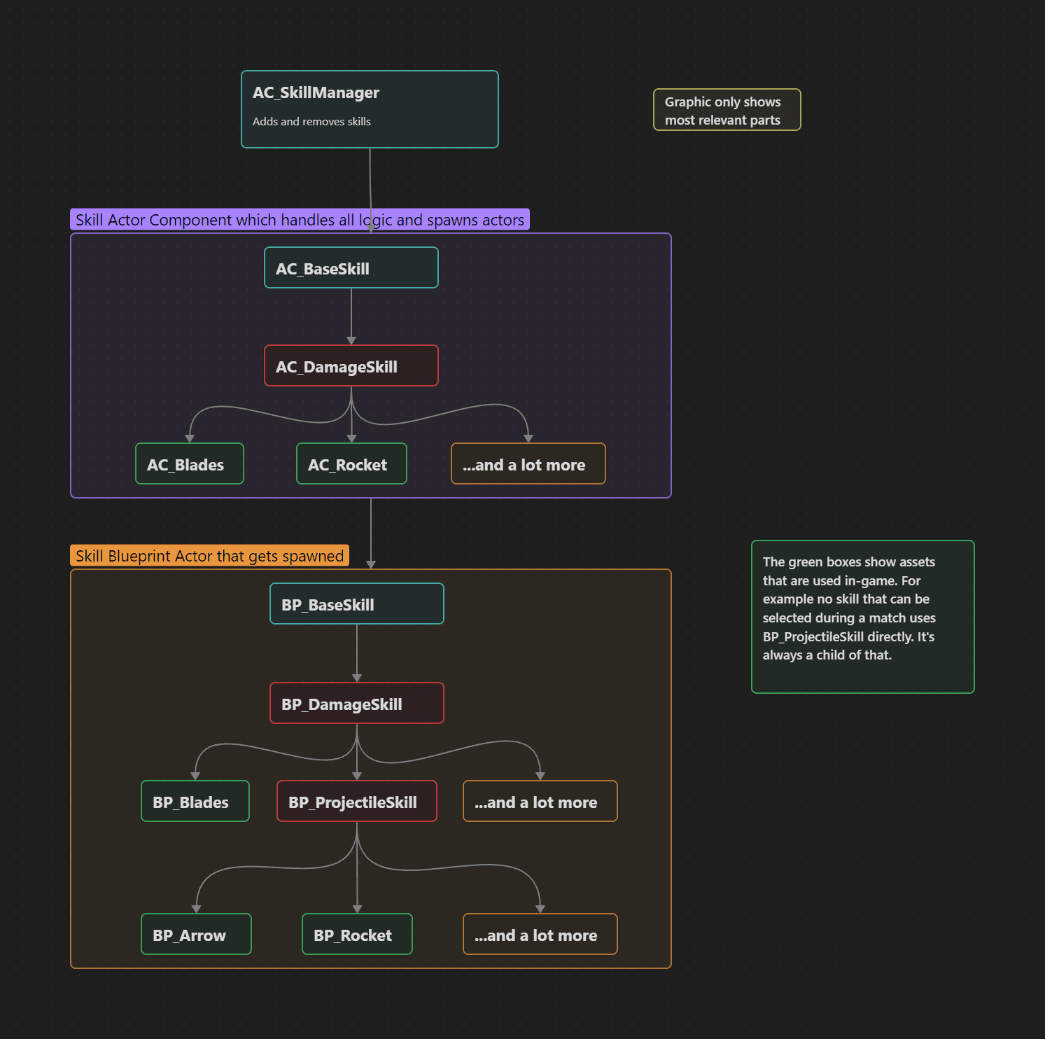
All logic regarding skills is handled by “AC_SkillManager” which is attached to every character by default through the combined parent “BP_BaseCharacter. Every time a new skill is added, its actor component gets attached to the character and handles all the logic for that skill. For example AC_SkillManager adds AC_Rocket and AC_Rocket spawns BP_Rockets every so often with a set of properties.
The Skill actor components also handle things like level up (skills can be leveled up if selected multiple times in the level up skill selection) as well as how they work.
Buffs
All logic for buffs is handled by “AC_BuffManager” which is attached to every character by default through the parent “BP_BaseCharacter”. Buffs work by constructing a Blueprint object that’s much more lightweight than an actor and handles the buff’s logic.
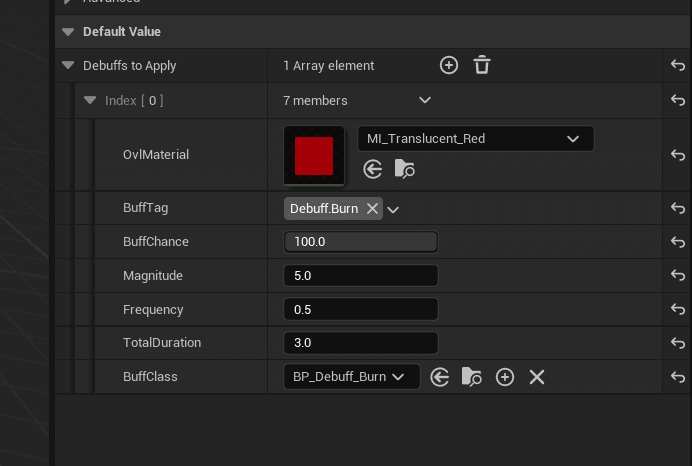
Usually, all skill actors that inherit from “BP_DamageSkill” have an array called “DebuffsToApply” where you can set up the debuffs to apply to a character when it overlaps with the skill. Properties you can set include the chance of the debuff being applied. The magnitude specifies how much damage to deal and frequency is how often in seconds the magnitude gets applied. The total duration says how long the debuff lasts in total. The Buff Class handles the logic.
In the example below, the Burn debuff gets applied to the character and deals 5 damage every 0.5 seconds for 3 seconds—6 times in total. The chance this debuff gets applied is 100%. The Overlay Material is a translucent red that shows the character has that debuff applied to it.
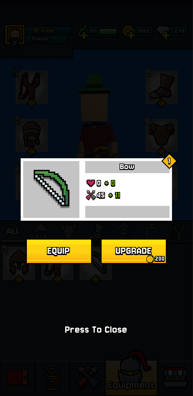
Equipment
The equipment was designed in a way that every item can add to the health and damage values. However, the current setup is that all items give health besides weapons which only give damage and accessories give both. Also, any item can be upgraded in level and has a rarity that’s Common, Uncommon, Rare, Epic or Legendary.
Leveling up an item multiplies the base item attributes with values specified in curves and not only do the factors vary by level but also by rarity. The price it takes to level up an item is also defined in a curve.
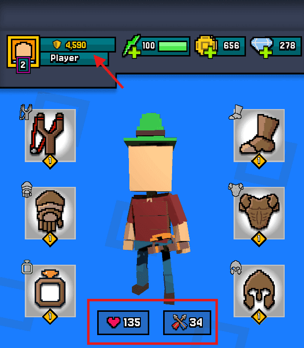
Health and Damage
The total health and damage attributes are the sum of the health and damage values of all equipped items. Other items in the inventory are not being taken into account. Weapons have this total damage value as their base damage and enemies deal half of that as their melee range unless they are Melee Enemies that don’t have a weapon equipped, then that damage is their melee damage.
Power is calculated as a simple multiplication between the total health and damage of the player.
Tutorials
Version Changes
V1.0.0.0
Initial Launch version.
Resources
Rig your character mesh to the UE5 manny: How to import & export UE5 Rig (From Blender)
Import your rigged character to UE5: Import Rigs and Animations to UE5 (From Blender)